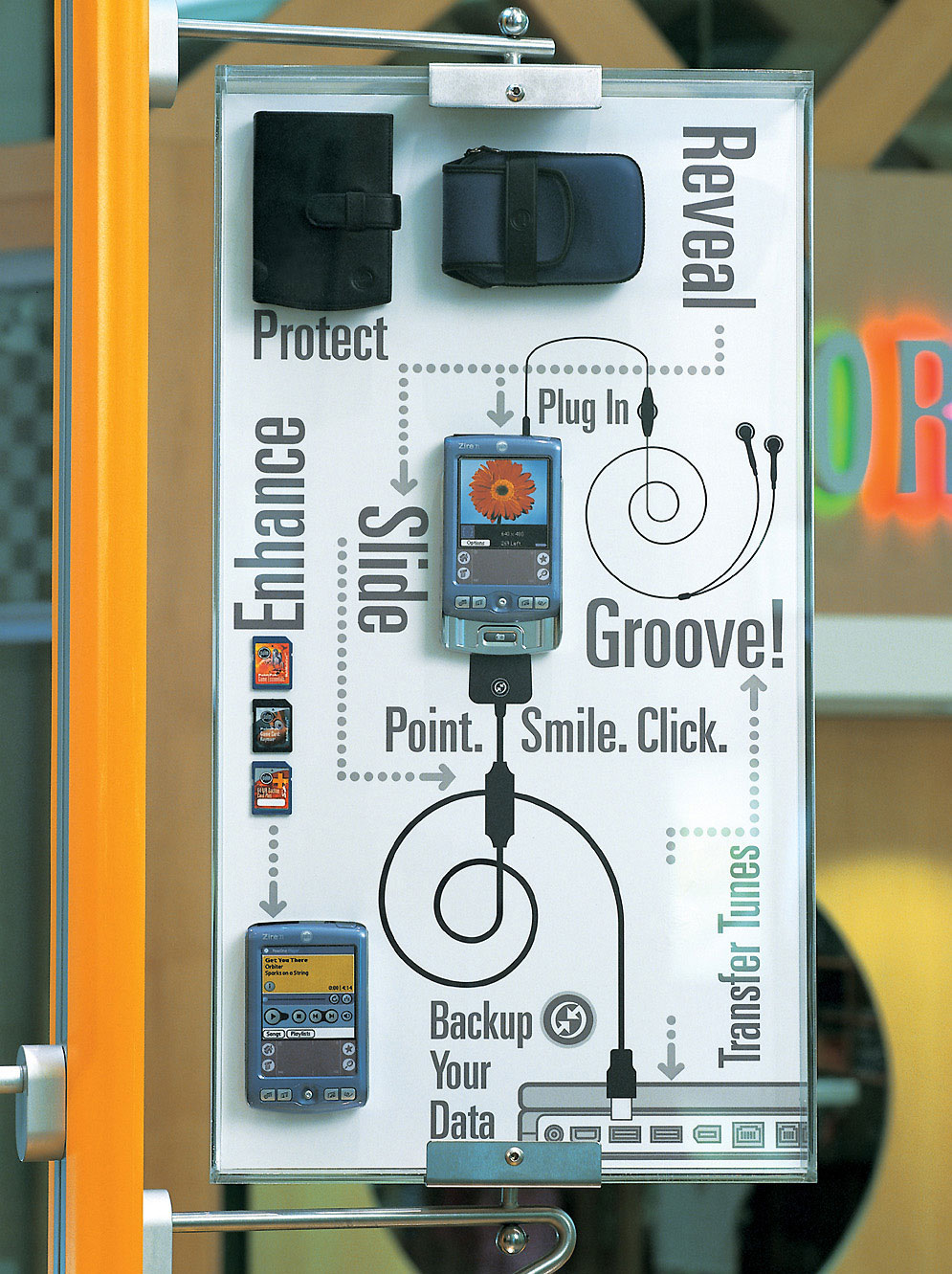
Simple, chart-like graphic design and catchy key phrases can be essential for in-store communication, especially for technologies that rapidly change. Soft, rounded shapes can reduce intimidation and invite customers to engage with new tech.
Palm is a line of personal digital assistants (PDAs) and mobile phones developed by California-based Palm, Inc., originally called Palm Computing, Inc. Palm devices are often remembered as “the first wildly popular handheld computers,” responsible for ushering in the smartphone era. The first Palm device, the PalmPilot 1000, was released in 1996 and proved to be popular. It led a growing market for portable computing devices where previous attempts such as Apple’s Newton failed.
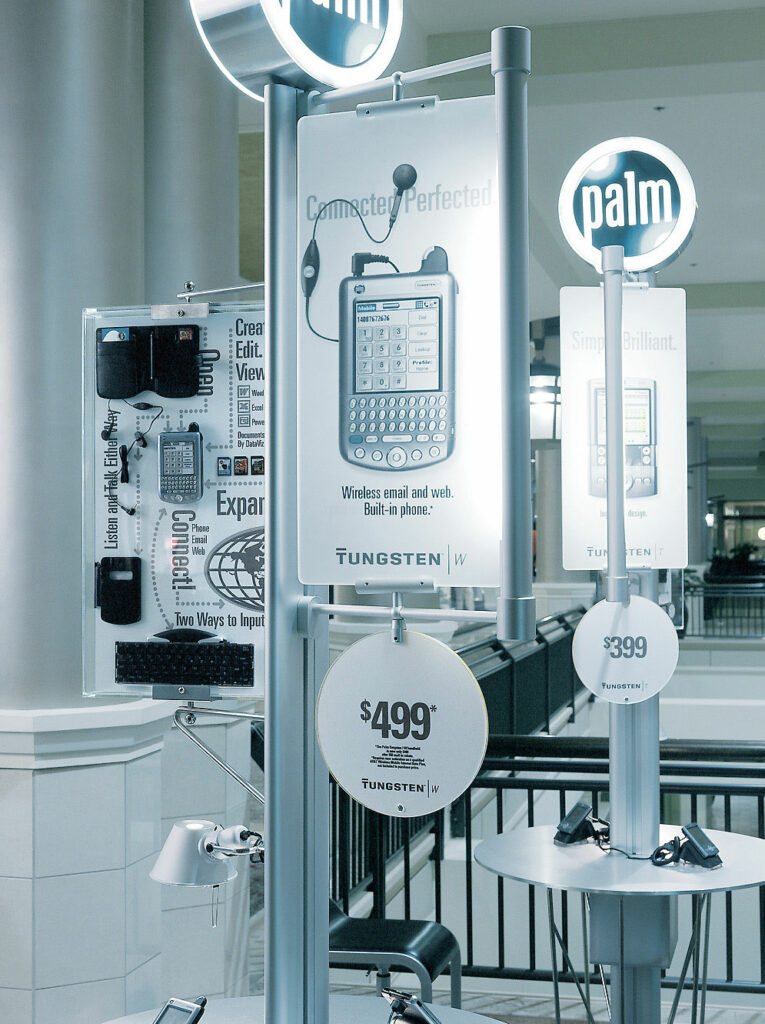
As further versions of these coveted devices were developed, Palm found a new niche to enter the brick-and-mortar retail arena with it’s own stores. I was contacted by them to create a visual language for the brand as well as how to communicate the many technological features of the devices.
Typography and graphics played an important role in the Cafe’s. While customers were invited to sit and play with the devices, often a sales associate could not sit with each customer. These signage and graphical explanations told the stories of the different features of each model. The rollout Cafés incorporated the recently launched Sorbetti System.